

How to Give Cover Feedback
A look under the hood of book cover design process, why you're likely to have an in-house liaison, and why AI is not welcome

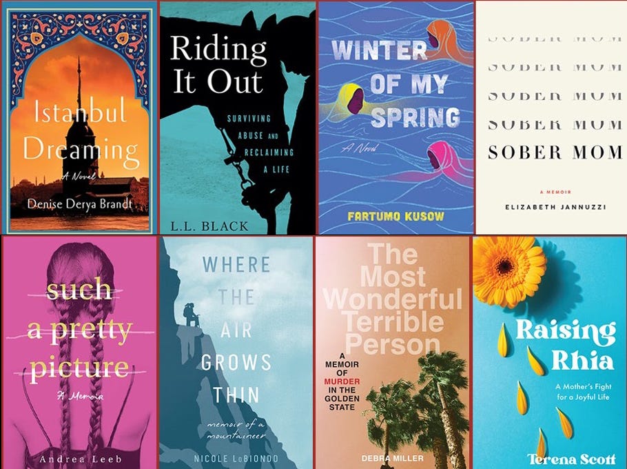
Book publishers have an interesting job. We do a lot of things, but above all else, we are author therapists, author whisperers, and author wranglers. In my work with authors, I let them know up front that the place we’re most likely to tangle, if we do, is on cover design.
As such, I want to use this post to get under the hood on cover design, and to offer some guidance on how to give feedback. Increasingly I’m finding, due to AI, that the cover design process has gotten a little more fraught. This is an example-heavy post, since my goal here is to offer context and guidance for any author who finds themselves staring at cover concepts and trying to sort through which one to choose or how to move forward.
When I first got into publishing, I didn’t realize that a major part of my job would be “liaison.” Editors and publishers and agents are just that—we are liaisons to other people in the author’s orbit. We interpret and champion and advocate for our authors, but we also push back when authors are being unreasonable, or when they’re inadvertently getting in their own way. Where covers are concerned, I want my authors to love their covers, and I have another equally pressing mandate, which is to hold the line on professional standards and to make our sales reps love our covers, too.
So yes, if I wrangle with authors, it’s going to be over their covers. I warn about this in advance, and impress upon them the reasons I’ll go to the mat with them from time to time. I’ll never do so without explaining why. I see tough conversations about covers as an expression of a publisher’s care for their authors and for their publishing programs. You really don’t want a publisher who will roll over and let you just have any cover you want without discussion.
We all know the idiom, Don’t judge a book by its cover, but of course that’s absurd. I found this fun quote from production designer and costume designer Ingrid Weir: “Why would they have book covers if we aren’t supposed to judge the book by them? It makes no sense.”
Exactly.
Why Liaise?
Before we get to the meat of it, the liaison thing merits a bit of explanation. Sometimes authors get their designs and ask if they can be in touch with their designer or illustrator directly. The reason publishing houses don’t allow this is because your liaison’s job is interpret.
As a publisher, and formerly as an editor, I have the relationship with my authors. My role with my authors is to champion them, stick up for what they want, and distill any feedback to the design team. I serve a similar role on behalf of my design team, which is to stand up for them, and to push back on authors when they’re not making choices we can stand by. Publishers have to tend to multiple masters—their authors, their own team, and the people who sell and buy their books.
And while it’s possible for designers and authors to do this work together, of course, when you publish with a house, it’s important to remember that the designer is working for the house and not the author. As such, the liaison is in place to be a bridge—to hopefully get to a place where everyone with a stake is happy: author, publisher, editor, designer, agent, sales team, book buyers, and ultimately readers.
On Good Feedback
At most publishing companies, you’re presented with cover concepts, affectionately called “cover comps” in the business. These arrive via email from your liaison—usually your editor and sometimes your publisher, depending on the size of the house and their process. Sometimes these are quite polished, nearly finished cover designs, and sometimes they’re rougher (especially in the case of illustrated covers, when we present sketches well ahead of anything refined).
I’ve struggled over the years about how much direction to give authors about how to give feedback because I don’t want to impose my thoughts up front. I want authors to receive the imagery without my voice in their ear. We won’t send authors covers we don’t stand behind, so in a perfect world, authors choose one of our concepts and we celebrate.
But we do not live in a perfect world, and of course we welcome author feedback, and we expect some back-and-forthing.
As feedback is expected, here are some best practices:
1. Be explicit. If you’re sent five comps, the goal is to narrow the choices down to one, possibly two, if you’re truly torn. Make sure to give the image number that corresponds with the file (cover 1, 2, 3) or attach a screenshot so it’s abundantly clear which concept you’re choosing.
2. Consider the elements: the background, the image, and the type. These elements are usually (not always but usually) interchangeable. So if you love an image, but not the background palette, that’s an easy fix. If you love everything about a cover (composition, image, background) but prefer the typography from another comp, that’s an easy fix, too. Our Art Director, Julie Metz, often says that our cover comps are like a Chinese menu—which means you get set of choices and you can choose parts of what you like from different categories and columns.
3. Bullet-point your feedback. Few authors do this, but man do we love it. Authors can be a wordy bunch, and sometimes the feedback I get makes me feel like an investigator looking for a clue in a sea of evidence. To distill your feedback, go back to the above-mentioned elements: background, image, type.
Let me share an example of excellent cover feedback. When we got this, Julie suggested I share it with all our authors, so here’s my opportunity.
In this case, the author received sketches because the book is illustrated. But if this were a photographic rendering, the method of breaking out the feedback by element is a beautiful model.
Here are the concepts she was presented with:
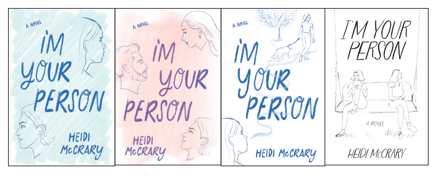
And here’s what she wrote:
COVER FEEDBACK
I love this artist and her style—perfect for a chick lit cover. I feel like this accurately mirrors the feel for the story we’re telling, and the readers it’s targeting.
Note from Brooke: always a nice touch to lead with what you like.
I understand that this is a rough draft, and because I’m told that my feedback is welcome, I will ask for the world and settle for Cleveland (No disrespect to Cleveland).
Note from Brooke: a mindset to live by!
Please proceed with Illustration #4, with the following requests...
Elements
• Typeface: No change. Love this font and layout.
• Lady on Left: brunette; black pants (She is always wearing black)
• Lady on Right: redhead; a little more defined outline of her left breast (our right) She’s small breasted, so not larger, just a little more defined.
Background: I’d like this to be a nighttime scene, and I loved the background the artist created in the illustration below––the deep blue.
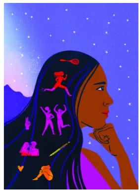
• The scene is a backyard, with hanging solar lights. Please add some twinkling lights. Stylize however you’d like.
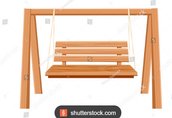
Bench—can we add some slats, so it looks more like a swinging bench? I’m including this stock photo only to show one option of the three horizontal slats.
Here’s what we sent back to her as a result of her clear direction:
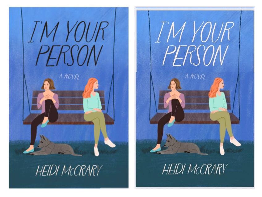
Her requested changes to Round 2:
1) I choose the white title
2) Please pop the overall colors
3) In the title, please make the capital I and the apostrophe in “I’M” fatter.
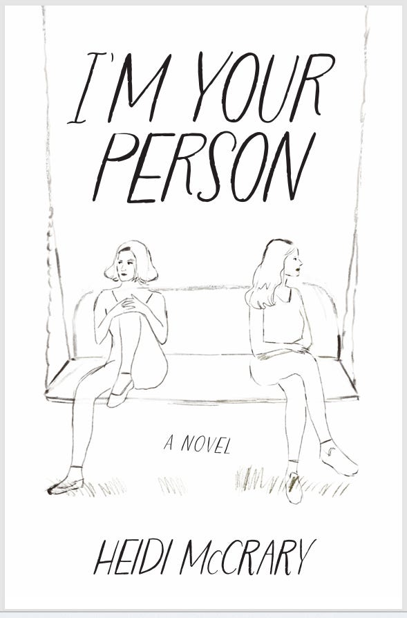
Which led us to our final cover:
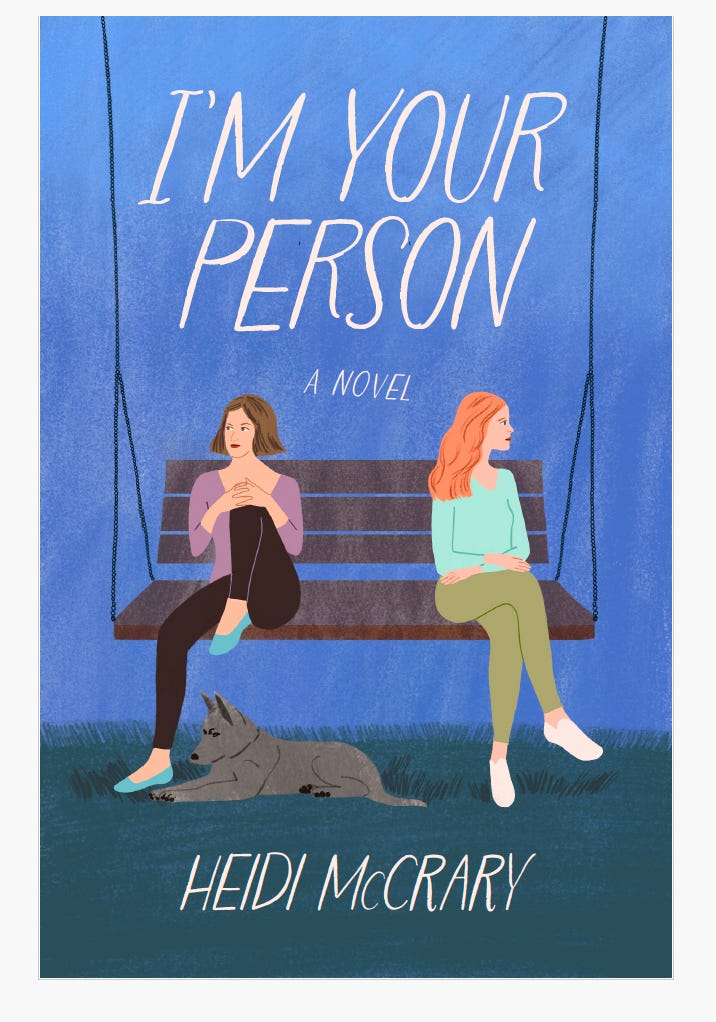
This is a pretty typical process, by the way, to have the author give high-level feedback that takes us to Round 2, and then the goal from Round 2 to the next to be to get to Final.
This is not how it always goes! But the purpose of this show-and-tell is to give some insight into feedback and process when it goes well.
On the challenges of visual feedback and AI
I understand the impulse on the part of authors, especially those who are visually oriented, to offer visual feedback. Another job I have as liaison is to intercept visual feedback and decide whether or not I will share it with the design team. Usually I don’t. One of the reasons I don’t is because of respect I have for designers.
Sometimes authors aren’t thinking about the designer’s hard work, or how taking someone’s file and marking it up with your own changes is a lot like taking an artist’s canvas and drawing on it with your crayons. If that sounds harsh, I’m sorry—but this is really how it feels to me sometimes.
These days, AI has escalated our challenges enormously because more and more authors are feeding their ideas into AI and sending back visual concepts that leave us at a complete loss for how to move forward.
When I wrote about this previously, one commenter asked, “If [visual feedback] helps communication, what’s wrong with that?”
To which Tabitha Lahr, one my long-time, wonderful cover designers, weighed in:
I’m a cover designer and why I don’t want to see AI mockups is because they are so polished and specific that it stifles my creativity. Although the author is saying to not do this exactly, it boxes in my creative mind out of the gate to make something just like it. I think that an author thinking through what they would like to see with AI is helpful, but I would prefer a description of what they came to as opposed to seeing the actual AI cover results.
I’ll walk through a recent example of this for the purposes of showing where and how we hold the line against AI, and why it’s so challenging to deal with AI imagery (which we cannot license, oppose on principle, and simply will not use).
This author was presented with the following concepts:
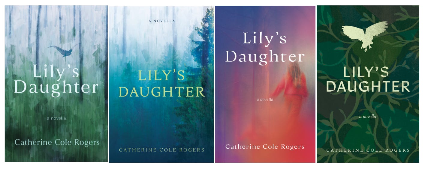
This is a spiritual story, and the Pacific Northwest plays prominently, so the goal was to get trees for the setting. The house at the center of the novella holds memories of the protagonist’s dead mother, and it’s “haunted” by two angels. Notably, we approached this as a “literary” cover.
When the author got back to us, she sent two AI generated covers for “inspiration”:
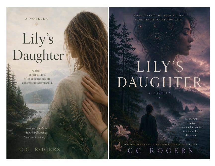
I share this not to call out this author, but to show what it’s like for us when we present a set of concepts and get back something that’s so wildly different that it’s hard to know what to say or do. I understand how and why working with AI might be fun for authors. Here’s this powerful tool that can bring to life your inspirations. And maybe if this author wanted to self-publish, she could have gone with something like this and her readers would be none the wiser.
But for She Writes Press and for the standards we and other publishers hold, there are a number of issues with these covers, even as inspiration. They don’t look like anything we ever have or ever would publish, which is not top of mind for many authors, understandably. Every publisher has a “vibe” and there’s certain imagery that’s really out of our realm.
Also, in this case and increasingly, AI covers (like these) are easy to spot. Recently, an author approached me because she had gotten into a challenging situation with her publisher and was thinking about leaving. She asked if we would publish her book, which is basically done and ready to go to print. I asked her to send me the cover and interior, but as soon as I saw the cover I knew it was AI-generated. I asked her to confirm this with her other publisher, and she forwarded me the publisher’s response, which was: “The designer uniquely created it for your book using Adobe Photoshop’s generative AI tool as part of the design process.”
Not happening on She Writes Press, and importantly, people, the AI battle is at full tilt in the publishing industry right now, so best to keep AI out of your writing and out of your designs.
The analogy I offer to authors who give overly specific visual feedback is that it’s like hiring a choreographer to come up with a dance, and then saying, Actually, never mind, here are the exact moves I want you to do. That choreographer would walk out before you could even blink—because they were hired for their creative interpretation.
The author of Lily’s Daughter, had gravitated toward the girl from the first round, so after some good conversations, this is where we landed, which is an example of a compromise cover in that we both gave up a little of what we wanted to meet in the middle.
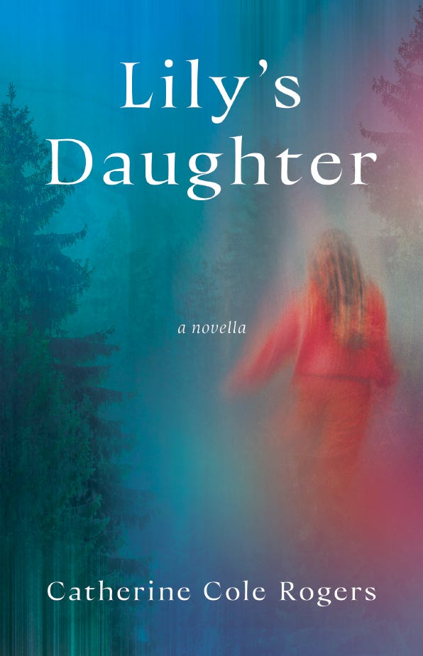
To be clear, there’s more than one good cover outcome for a given book. As you can see with Lily’s Daughter, positioning is key. Is the book more literary, or is it genre fiction? Publishers take into consideration other books in your genre and category, what’s selling and on trend right now. They want to be creative and unique, but also they want to create something that booksellers will love, and recognize as professional and meeting the standards they expect.
Cover designs are often hard-won—for the publisher and the author. But good, direct, honest, and sometimes tough conversations about a cover design are worth it. I’m insanely proud of She Writes Press’s cover program, and it wouldn’t be what it is if we were quick to compromise, or if I wasn’t willing to sometimes go to the mat with my authors. It also wouldn’t be what it is without Julie Metz. But importantly, sometimes I do compromise, and sometimes we wrangle in house with on another. Sometimes authors push back and they are right. Sometimes working through points of disagreement bring us to clarity‚ and to some of the best covers. There’s nothing linear or straightforward or template-able about this process, which is also why humans having human interactions about what works and what doesn’t, while not always comfortable, is ultimately rewarding. Your book will be judged for its cover, so I hope for everyone reading that you’re happy with your cover, or that you learned something here that will support you toward your future outcome!
If you have a cover story to share, bring it. I know my readers would love to hear about it.
I found myself staring at those 2 AI examples, and they scream "self-published" (in the worst way). But the ah-ha for me is that, OMG, people (authors, readers, the public) actually are attracted to the AI style. Tabitha called it "polished and specific"; I agree but would add insipid and saccharine and mawkish--to the point of reality-denying. And, yes, fiction is imagined. But by definition, if it is imagined by humans, it doesn't deny human reality.
I’m glad you showcased @Heidi McCrary’s book cover and her reasonable, perceptive, specific feedback during the design process. Unlike many authors, Heidi appears to be highly skilled in interpersonal exchanges — a lead-from-behind leader. (And the cover does make me want to read her book!)